")
When preparing for the PTE Academic exam, one of the key tasks in the Describe Image section involves interpreting and describing a table chart. Although it may seem challenging at first, with the right strategy, you can deliver a clear and concise response with ease. In this blog, we will discuss useful tips, a simple template, and sample answers to help you tackle table chart questions with confidence.
Understanding the Table Chart in PTE
A table chart in PTE displays data in rows and columns, allowing you to compare different sets of information. The data can include categories like years, regions, or subjects, with numerical values or percentages for each. You have to identify key trends or patterns and summarize them clearly within 40 seconds.
Tips for Describing a Table Chart in PTE
Here are some tips to help you describe a table chart effectively:
1. Understand the Table Thoroughly
- Begin by reading through the table to understand what information is being presented.
- Identify the categories (rows or columns) and understand what they represent.
- Pay attention to significant numbers and identify the highest or lowest values in each category.
2. Structure Your Answer
A well-organized response ensures you cover all the important details within the limited time. Here’s how you can structure your answer:
- Introduction: Briefly introduce the table and mention the key categories and time period, if applicable.
- Details: Describe the main trends or patterns in the data and talk about any significant increases, decreases, or consistency across the categories.
- Comparison (if applicable): If the table compares multiple categories, mention how they differ or which ones show higher or lower values.
- Conclusion: Offer a summary of the overall trend or pattern in the table.
3. Use Simple and Clear Vocabulary
Use clear, straightforward vocabulary to describe the data. Avoid using complex terms or jargon. For example:
- Increase: rise, grow, increase, go up
- Decrease: fall, drop, decline, go down
- Stable: remain constant, stay the same, level off
- Comparison: higher, lower, greater, lesser, more, less
4. Focus on Key Data
- Don’t describe every single number in the table. Focus on key trends or important figures.
- Mention the highest or lowest values, and note any significant changes or differences between categories.
5. Time Management
You have 25 seconds to prepare and 40 seconds to respond. Use your preparation time to analyze the table and organize your thoughts. Keep your response clear and concise.
Template for Describing a Table Chart
Here’s a simple template to help you organize your response when describing a table chart:
Introduction:
The table shows the (data topic) in (time frame), comparing (mention the categories, such as years, regions, or subjects).
Details:
From (time/row), we can see that (category 1) shows a steady increase, reaching (value) by (time/row). In contrast, (category 2) shows a decline, dropping from (value) to (value) in (time/row).
Comparison:
Comparing (category 1) and (category 2), it is clear that (category 1) consistently has higher values than (category 2). For instance, in (year/row), (category 1) is recorded at (value), while (category 2) stands at (value).
Conclusion:
In conclusion, the table indicates a (general trend, such as increase, decrease, or stability) in (category), with the most significant change occurring in (specific time/row).
Sample Questions with Answers
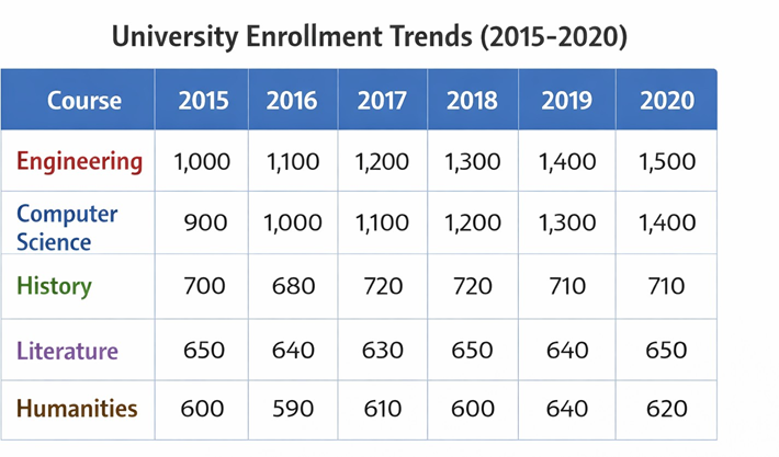
Answer:
The table illustrates the number of students enrolled in various courses at a university from 2015 to 2020. In 2015, there were around 1,000 students enrolled in Engineering, and by 2020, this number had risen to 1,500. Conversely, courses like History and Literature remained relatively constant over the years, with only slight variations. In conclusion, Engineering and Computer Science saw the highest increase in enrollment, while the Humanities courses remained stable throughout the period.
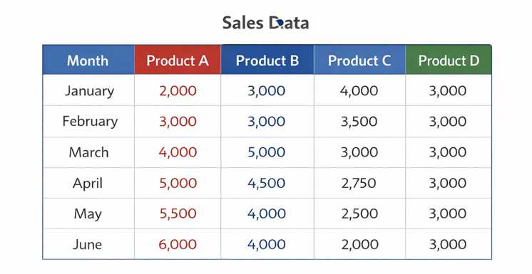
Answer:
The table displays the sales of four products from January to June. Product A had a consistent increase in sales, rising from 2,000 units in January to 6,000 units in June. Product B saw a sharp rise in March, reaching 5,000 units, but then decreased to 4,000 units in May. Product C’s sales steadily declined from 4,000 units in January to 2,000 units in June. Product D maintained stable sales at around 3,000 units each month. In conclusion, Product A experienced the most growth, while Product C showed the most decline, and Product D remained steady throughout the period.
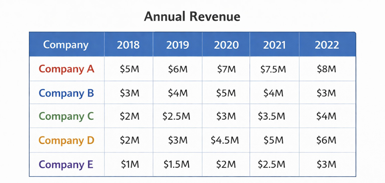
Answer:
The table shows the annual revenue of five companies from 2018 to 2022. Company A generated the highest revenue each year, starting at $5 million in 2018 and reaching $8 million by 2022. Company B’s revenue fluctuated, beginning at $3 million in 2018, peaking at $5 million in 2020, and then dropping to $3 million by 2022. Companies C, D, and E showed steady growth, with Company D seeing the most significant improvement, rising from $2 million in 2018 to $6 million in 2022. In conclusion, Company A led in revenue, while Company D showed the most substantial growth over the five years.