When preparing for the PTE Academic exam, one of the most important sections is the Describe Image task, particularly when it involves a line graph. This task may seem challenging at first, but with a few clear strategies and a well-organized template, you can attempt line graphs effectively. In this blog, we will discuss the tips, a simple template, and provide answers to some frequently asked questions with examples to help you boost your score.
Understanding the Line Graph in PTE
A line graph in PTE shows data points connected by straight lines, representing trends or changes over time. The graph could compare multiple variables or show a single trend over different periods. Your goal is to summarize the key points of the graph in a concise, clear, and well-structured response. You must describe the main trends, differences, and any notable changes.
Tips for Describing a Line Graph in PTE
Here are some tips to help you deliver a clear and effective description of a line graph:
1. Understand the Graph Thoroughly
Before you start speaking, take a moment to understand the graph. Look at the x-axis (horizontal) and y-axis (vertical) to understand what data is being presented. Identify:
- The time periods, such as years, months
- The trends like rising, falling, and stable
- Key data points or peaks and troughs highest or lowest points
2. Structure Your Answer
A well-structured answer is key to performing well in the Describe Image task. Here’s how you can break down your answer:
- Introduction: Briefly introduce the graph. Mention what the graph represents and the time period.
- Details: Describe the key changes, such as increases, decreases, or fluctuations. Point out specific data points, peaks, or drops.
- Comparison (if applicable): If there are multiple lines or variables, compare them. Note which line is higher or lower at certain points, and any differences in trends.
- Conclusion: Offer a brief concluding sentence summarizing the main trends.
3. Use Appropriate Vocabulary
Use clear and varied vocabulary to describe the trends. For example:
- Increase: rise, grow, go up
- Decrease: fall, decline, drop, go down
- Stable: remain steady, stay constant
- Fluctuation: vary, alternate, shift
- Peaks: reach a peak, hit a low, the highest point, the lowest point
4. Focus on Key Data
Avoid giving unnecessary details. Focus on the most important information, such as:
- Significant changes
- Peaks, drops
- Comparisons between different lines or categories
5. Time is Key
Remember that the description must be concise. You have about 40 seconds to speak, so practice speaking fluently and at a steady pace without rushing or hesitating.
Template for Describing a Line Graph
Here’s a simple template you can use to organize your response when describing a line graph:
1. Introduction:
- . The graph illustrates the (data topic) over a period of (time frame).
- . The line graph compares (mention the variables) from (starting point) to (ending point).
2. Details:
- . The line shows a steady rise from (time) to (time), reaching a peak of (value) in (time).
- . After that, there is a sharp decline, dropping to (value) in (time).
- . Between (time) and (time), the data remains relatively stable at (value).
3. Comparison (if applicable):
- . While (Line A) increases steadily, (Line B) fluctuates significantly.
- . Compared to (variable), (variable) shows a greater/lesser increase in (time period).
4. Conclusion:
- . In conclusion, the graph clearly indicates a (summary of the main trend).
- . To sum up, the data reveals a (general trend) over the entire period.
Repeated Questions with Answers
Answer:
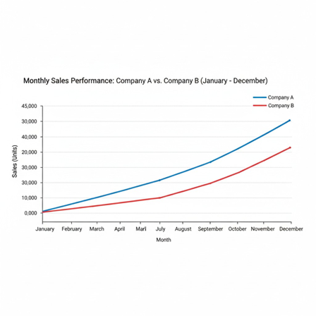
The line graph shows the monthly sales of two companies, A and B, from January to December. It is evident that company A’s sales begin at a relatively low level in January, at approximately 10,000 units. From February to June, sales steadily rise, peaking at 35,000 units in June. After June, sales decline slightly but remain stable around 30,000 units until December. On the other hand, Company B’s sales follow a more volatile pattern.
Starting at 15,000 units in January, they surge sharply to 40,000 units in March before dipping back to 25,000 in May. Company B’s sales then rise again, reaching 45,000 units in October, but drop back to 30,000 in December. In conclusion, while both companies show overall growth, Company A’s sales show a more consistent increase, whereas Company B’s sales experience significant fluctuations.
Answer:
The line graph shows the annual number of visitors to a museum from 2010 to 2020. The number of visitors began at around 50,000 in 2010, rising gradually to 80,000 by 2014. After 2015, the number of visitors increased sharply, reaching 120,000 in 2017 and peaking at 150,000 in 2020. To summarize, the graph shows a steady rise in museum visits over the 10 years, with the most significant growth occurring after 2015.

Answer:
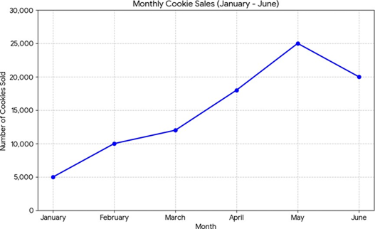
The line graph illustrates the number of cookies sold by a bakery from January to June. In January, the bakery sold around 5,000 cookies. Sales then increase gradually in the following months, reaching 10,000 cookies in February. March sees a slight rise to 12,000 cookies, and in April, sales jump to 18,000 cookies, marking the first noticeable increase. The bakery experiences a peak in May, with 25,000 cookies sold. However, sales drop slightly in June, falling to 20,000 cookies. In conclusion, the graph shows a consistent rise in cookie sales with an abrupt peak in May, followed by a slight decrease in June. Overall, the trend indicatesthe growing popularity of the bakery’s cookies.